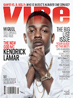
From my draft to my final production their was a huge change as i though the first draft was not conventional enough for my hip-hop magazine. I though this mgazine was much more better as it was similar to magazines which i conducted research into which is good since it allowed me to make my magzine a lot more conventional. Overall i changed my magzine complete from my first draft as i was not satisfied with the way it look and thought i would change it so it is more conventional and appealing to my target audience.
On my cover page
I went with a plain black Background since it was a conventional way background
for a hip-hop magazine. The
masthead BAZE I made this all capital since it would attract the audience’s
attention as it takes such a huge space on the cover page. My strap-line are in
two distinct colors as it would look more attractive to the target audience, I used
straplines as it will enable my audience to be aware of what is inside the
magazine. The Black and red colour scheme was influence by XXL magazine who are
very popular and successful hip-hop magazine company, this could suggest red is
a very conventional colour for hip-hop as they use it very frequently. I
kept this colour scheme going throughout my magazine. My main modal facial expression
is conventional for hip-hop magazine is he looks trouble and serious, His body
language suggests he is closed, this posture was inspired by Eminem who is a
very popular hip-hop artists. The character Clothing are black as it goes well
with the colour scheme of the magazine and black is also a conventional colour
for a rapper to wear. This evident due to the fact that majority of XXL artist
wear black whenever they are on the cover of the magazine. I used a
conventional bar code on the lower left side of the page since it is mostly
found there, and I also added the date as it is also usually placed on top of
it. I placed the prize of the magazine at the top left corner which an
unconventional place to put it, but I thought it would attract more attention
from the target audience. At the end of the editing I created an extra solid
lay and used it change the normal colours of the advert to more reddish to help
the cover photo to follow the colour scheme better.
For my content page I went with Black and white color scheme but still used some red to keep my colour scheme from my cover page. I conventional placed the title at the top of the page since it is most effective at the top allowing the audience to instantly become aware of it. My mast head is on top of the content heading and does take as much attention as the Content page. This is convention as only the content page is supposed to get the main attraction at the top of the page since it notifies the audience about it helping them to navigate throughout the magazine. I placed an image of the main artist since it was a conventional for the main artist to also appear on the content page to keep the audience interested. I also place an image of the editor to let the audience know more about the editor since it makes the content page much more entertaining. I did this by placing another picture to make the audience more entertained instead of just looking at a plain page full of text. For my background I used black since it went well with the previous content page and allowed me to continue my colour scheme from the previous page.

I choose to use a medium long shot to show
the whole body of the character as it allowed me to express his body language.
This is good because it allows me to portray the body language of the character
which is beneficial to as it allows my audience to relate with him since he
looks relaxed. The setting I choose for the double page spread is streets since
it enables me to relate to the young audience since the spend most of the time
outdoors. I placed the Text on the left side as it is where it is
conventionally placed. AS the title I place the character’s name as I mention the
page to be about him in the content page. For my color scheme I continued it
from the cover page and used red, black and white since they are wildly associated
with hip-hop since magazines such as XXL and VIBE constantly use those colours.
My character is wearing a jacket and back bag which is conventional for modern
day hip-hop stars to wear, for example; Lil Pump and J Cole have been seen
wearing back bags in their albums and usually wearing very expensive jackets on
their music videos. I used white text for the majority of my page as it was
easy to see on black. Half the page is an image of the artist which is conventional
in hip-hop magazine.


